When colors are juxtaposed, our eyes perceive a visual mix. This mix will differ depending on the proportions of allocated areas.
The color with the largest proportional area is the dominant color (the ground).
Smaller areas are subdominant colors.
Accent colors are those with a small relative area, but offer a contrast because of a variation in hue, intensity, or saturation (the figure).
Placing small areas of light color on a dark background, or a small area of dark on a light background will create an accent.
If large areas of a light hue are used, the whole area will appear light; conversely, if large areas of dark values are used, the whole area appears dark.
Alternating color by intensity rather than proportion will also change the perceived visual mix of color.
Dominant color Sub-dominant colors Accent Dominant color Sub-dominant colors Accent
Dominant color Sub-dominant colors Accent Dominant color Sub-dominant colors Accent


 Dominant color

 Sub-dominant colors
  Accent
 Dominant color

 Sub-dominant colors
  Accent
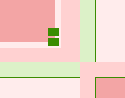
 Dominant color

 Sub-dominant colors
  Accent
 Dominant color

 Sub-dominant colors
  Accent